

The problem
Complex workflows, fragmented tools and manual processes increased cognitive load and created opportunities for operational error.
Case study · GroupNexus
Designing a complex platform that helps parking operators manage sites, permits, enforcement and ANPR infrastructure while turning millions of vehicle movements into actionable operational insights.
OutcomeCompany-wide, the network grew by 150 sites and the user base by 20% after the Permit & Form Builder launch.
Overview
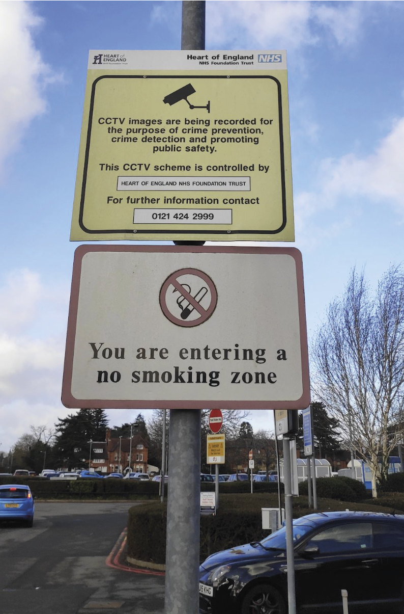
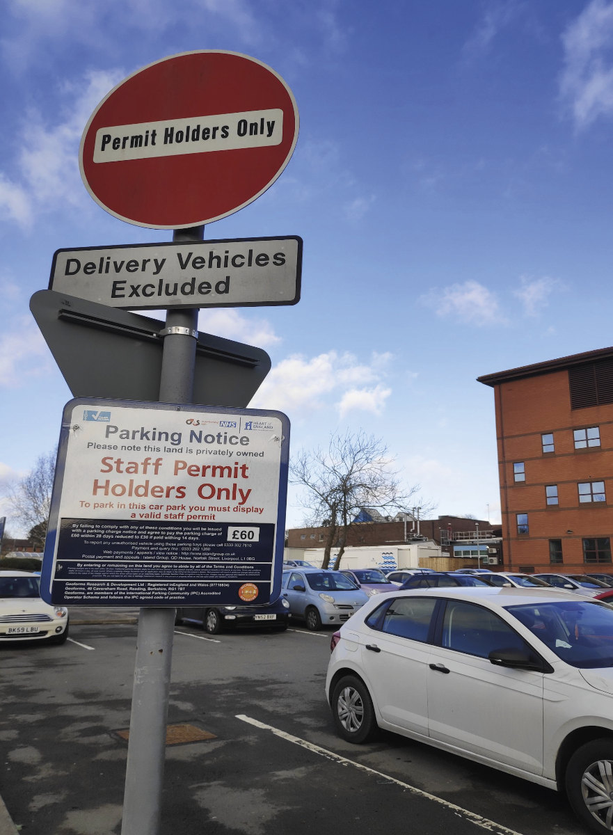
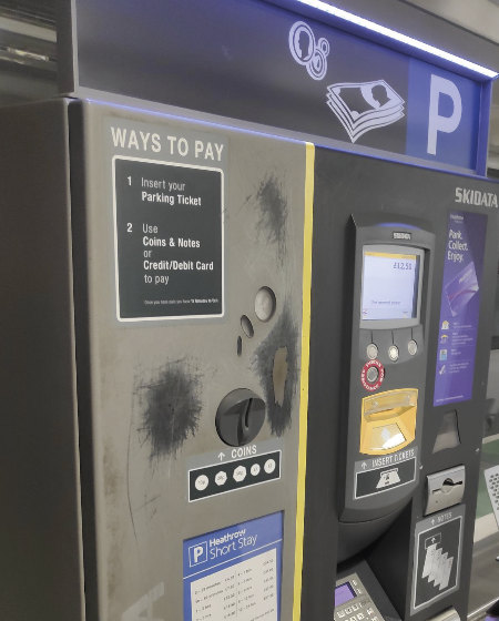
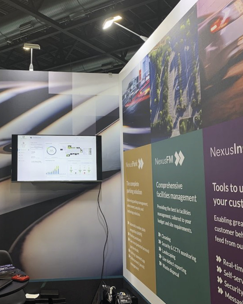
GroupNexus operates a technology-driven parking ecosystem connecting physical car parks, ANPR cameras, enforcement processes, permits, client reporting and millions of vehicle movements — a much more complex operational system than the simple parking journey drivers see.
Brief
My role was making that system easier to understand and operate: less friction in everyday workflows, and each user seeing the information and controls their job needs.
Complex workflows, fragmented tools and manual processes increased cognitive load and created opportunities for operational error.
Create clearer, faster and more scalable workflows without disrupting critical existing operations.
A more consistent product experience across management, monitoring, permits, enforcement and analytics.
Users

Internal GroupNexus teams monitoring the network, reviewing ANPR activity, managing enforcement and spotting operational problems.
Speed, accuracy, visibility
Manage users and permits for one or more car parks, and track occupancy, duration, visits and vehicle movements.
Control and insight
Support administrators with specific tasks, under controlled permissions rather than full platform access.
Minimal complexity
Drivers, employees, tenants and others applying for a permit.
Fast, clear completionThe challenge
A change to one workflow could ripple through several others. The chain below traces one example, from ANPR hardware to client-facing insight. The job was to keep each task simple without losing sight of that system.
Configure and run the parking ecosystem.
Turn raw ANPR activity into information clients can act on.
Process
An Agile team: internal users and clients (B2B) came first, then end users (B2B2C). Product owners, engineers, developers and the business joined at the stages that needed them.
Discover
Before changing screens, I explored the product as a system and worked with users and stakeholders to find where friction occurred and which processes carried the most operational risk.
2 weeks
Research sprint for the permit builder
12+
Interviews across every user role
3
Roles interviewed: Admin, Request Approver and End User
Also in the sprint: existing and competitor solutions, SWOT analysis and affinity mapping.
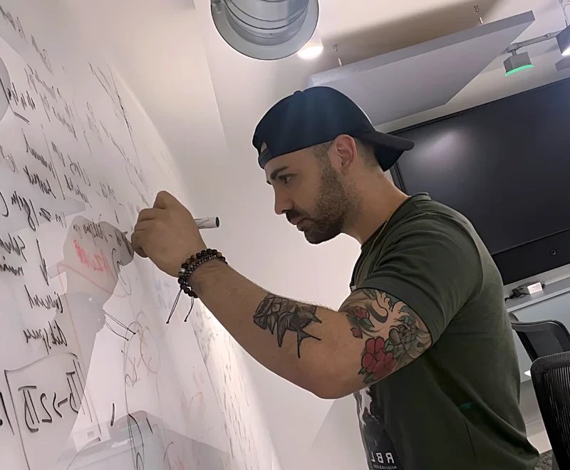
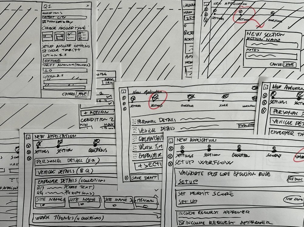
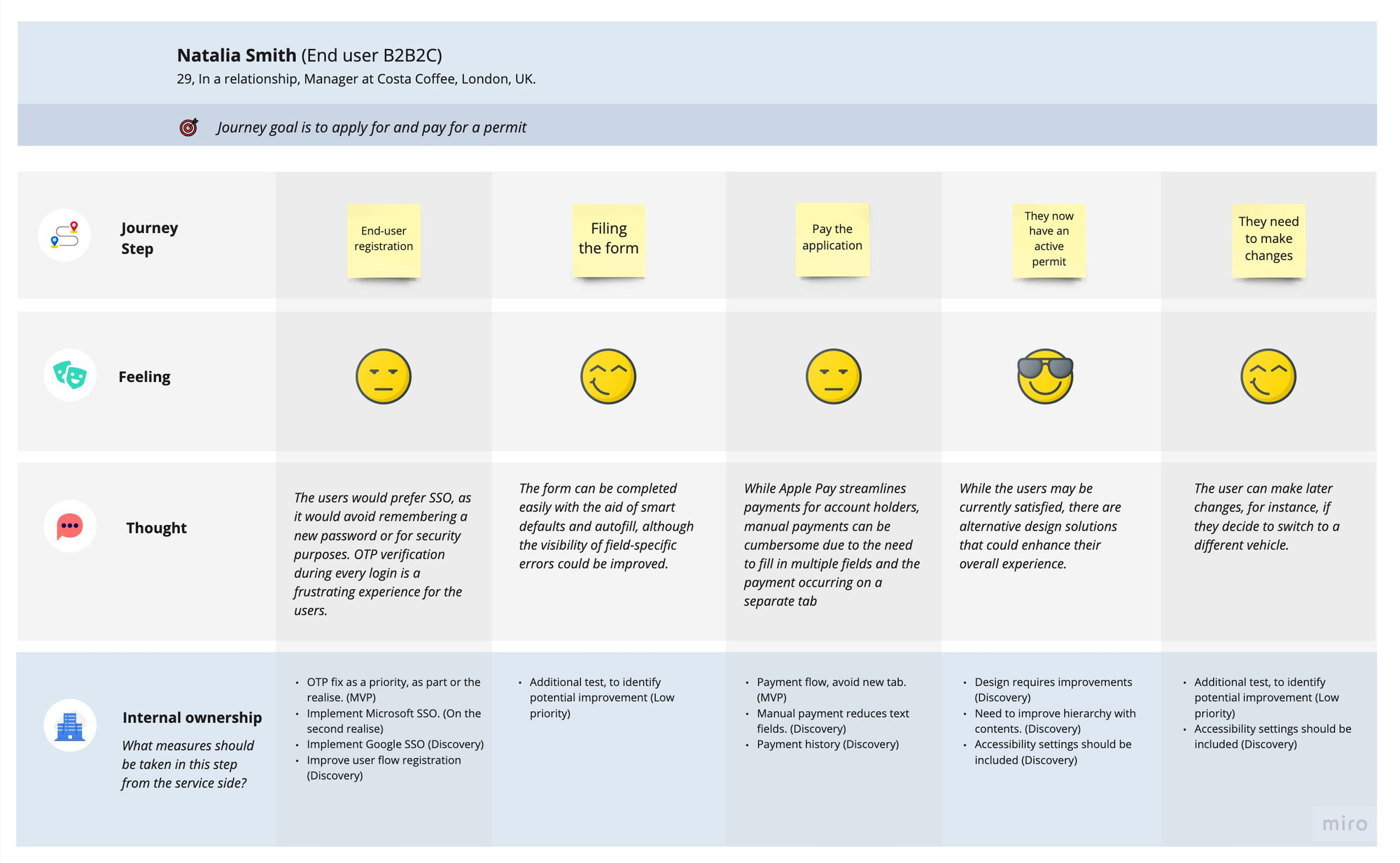
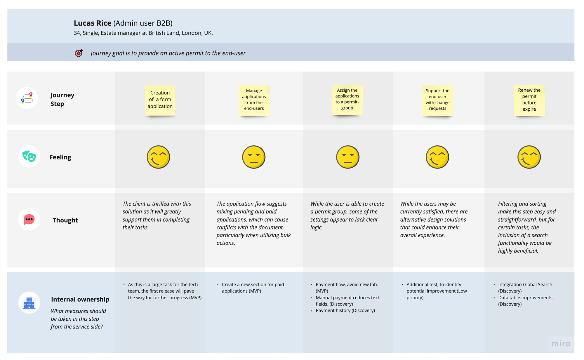
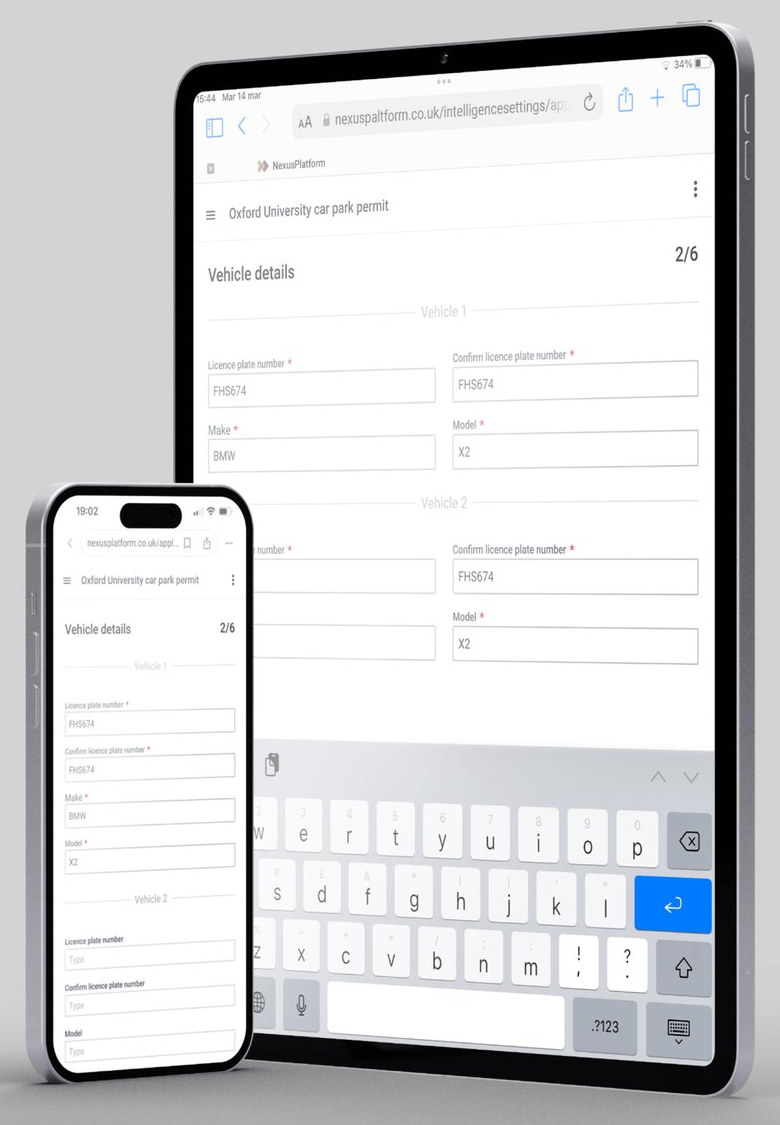
Asked for in the interviews. End users: mobile first, single sign-on, Apple Pay. Admins: minimum user criteria, a workflow they can set up, and a tariff set from the answers.
Common tasks needed several screens or configuration stages when one would do.
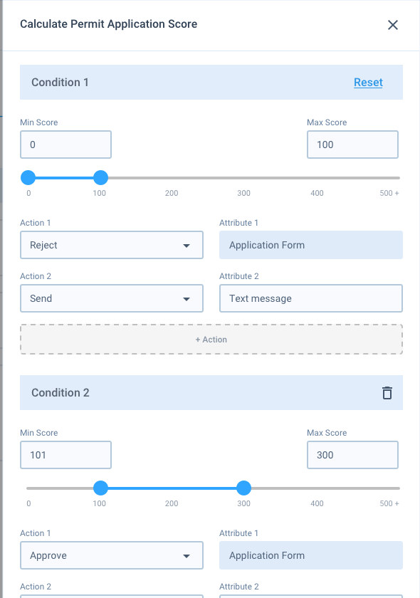
Scoring rules, conditions and enforcement actions were configured by hand, which added effort and room for error.
Device health and questionable ANPR captures needed to be spotted at once, not found.
Define
The product had to support sophisticated parking operations without showing that complexity to every user equally. I used progressive disclosure, clearer hierarchy, reusable patterns and role-based access.
Prioritise the information required to make the next decision.
Reduce unnecessary manual actions where rules could safely handle them.
Expose functionality according to responsibility and permission.
Solve recurring interaction problems consistently across the platform.
Feature deep dive · Permits & Form Builder
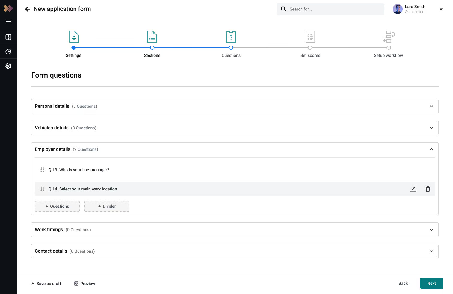
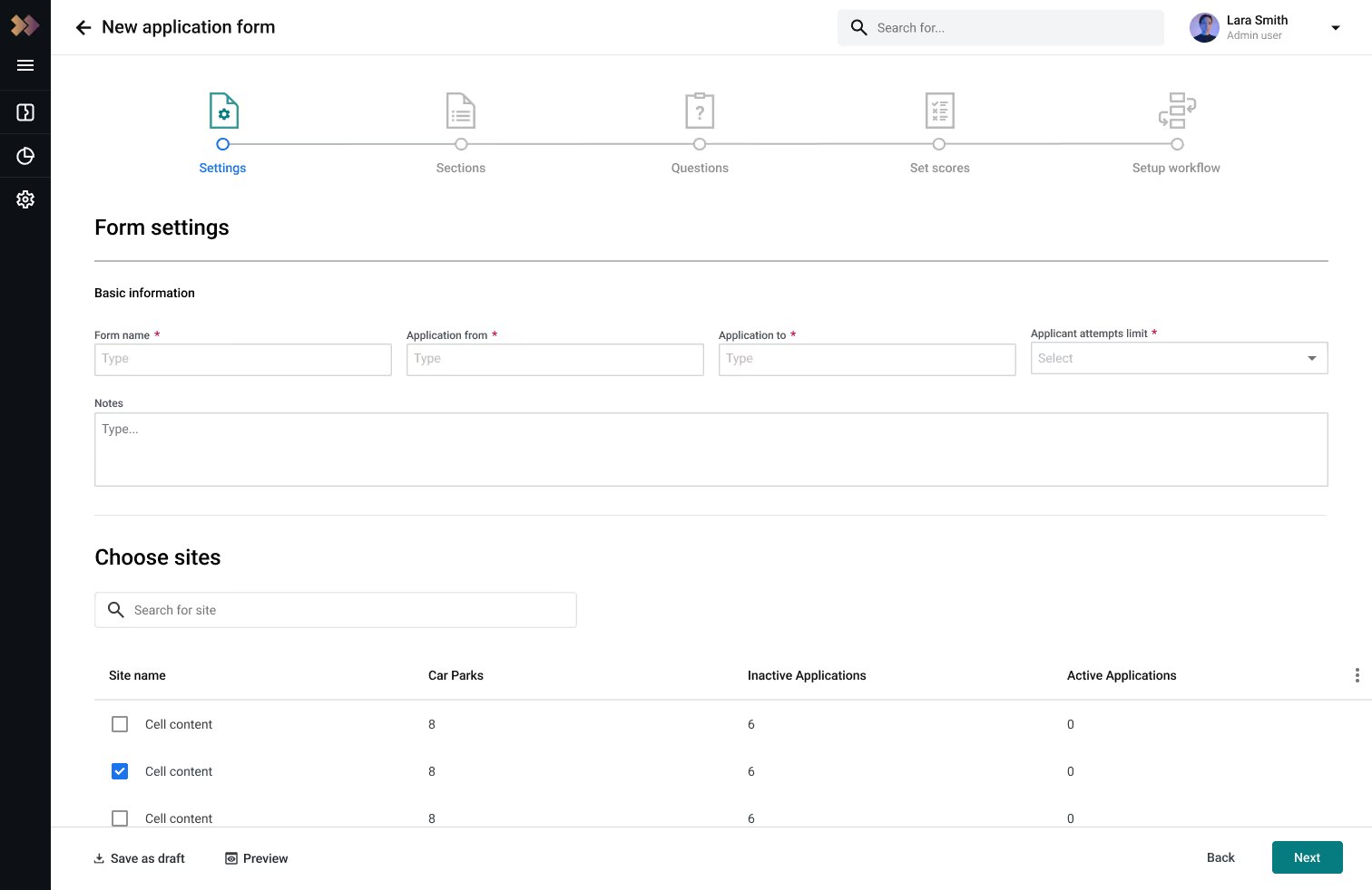
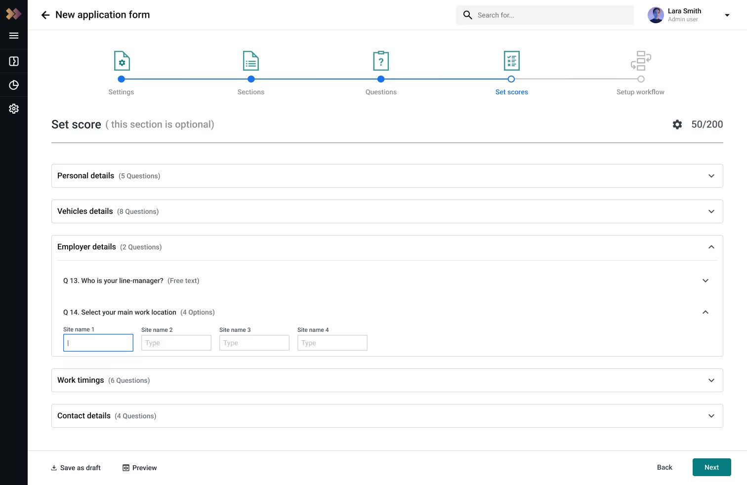
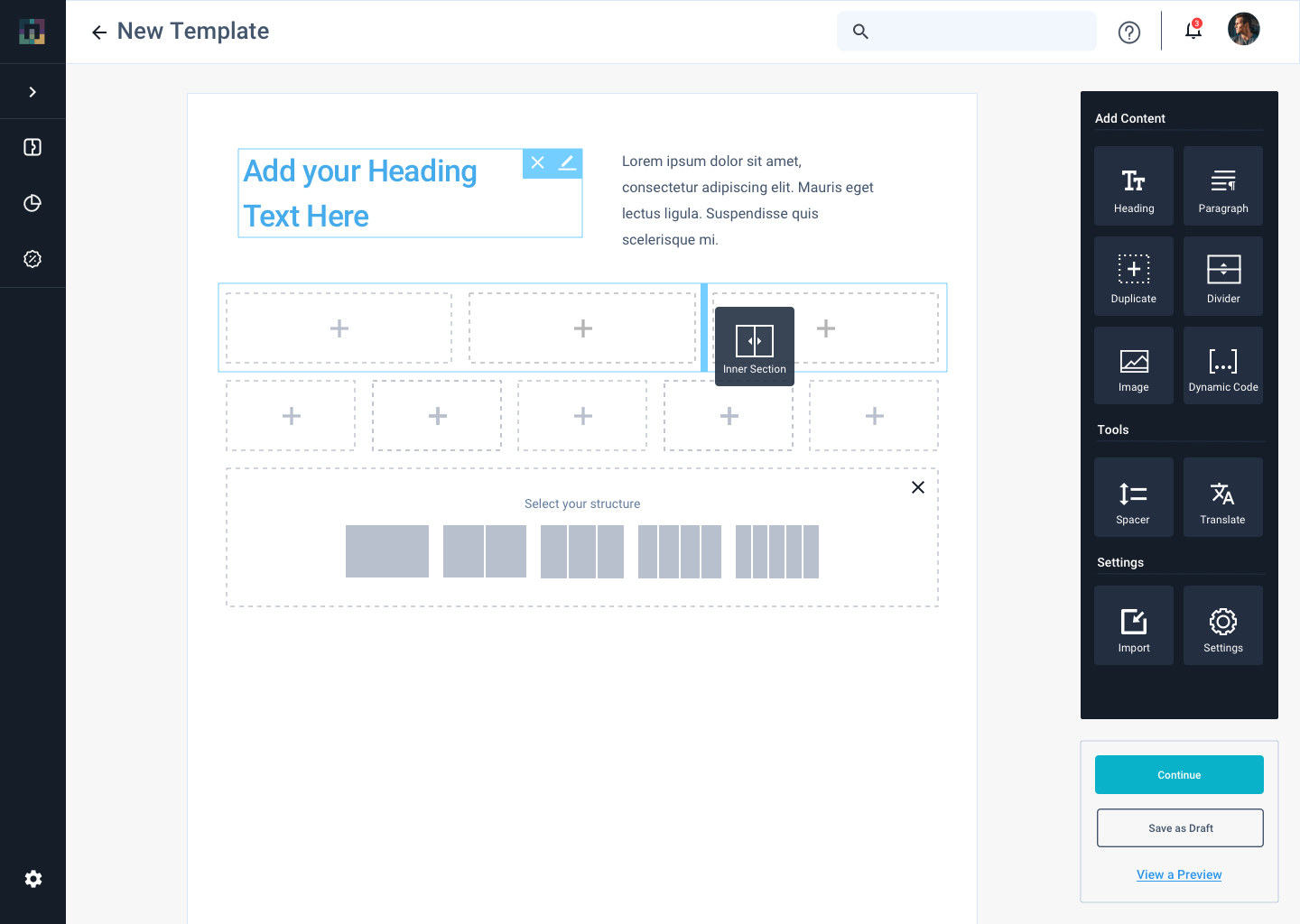
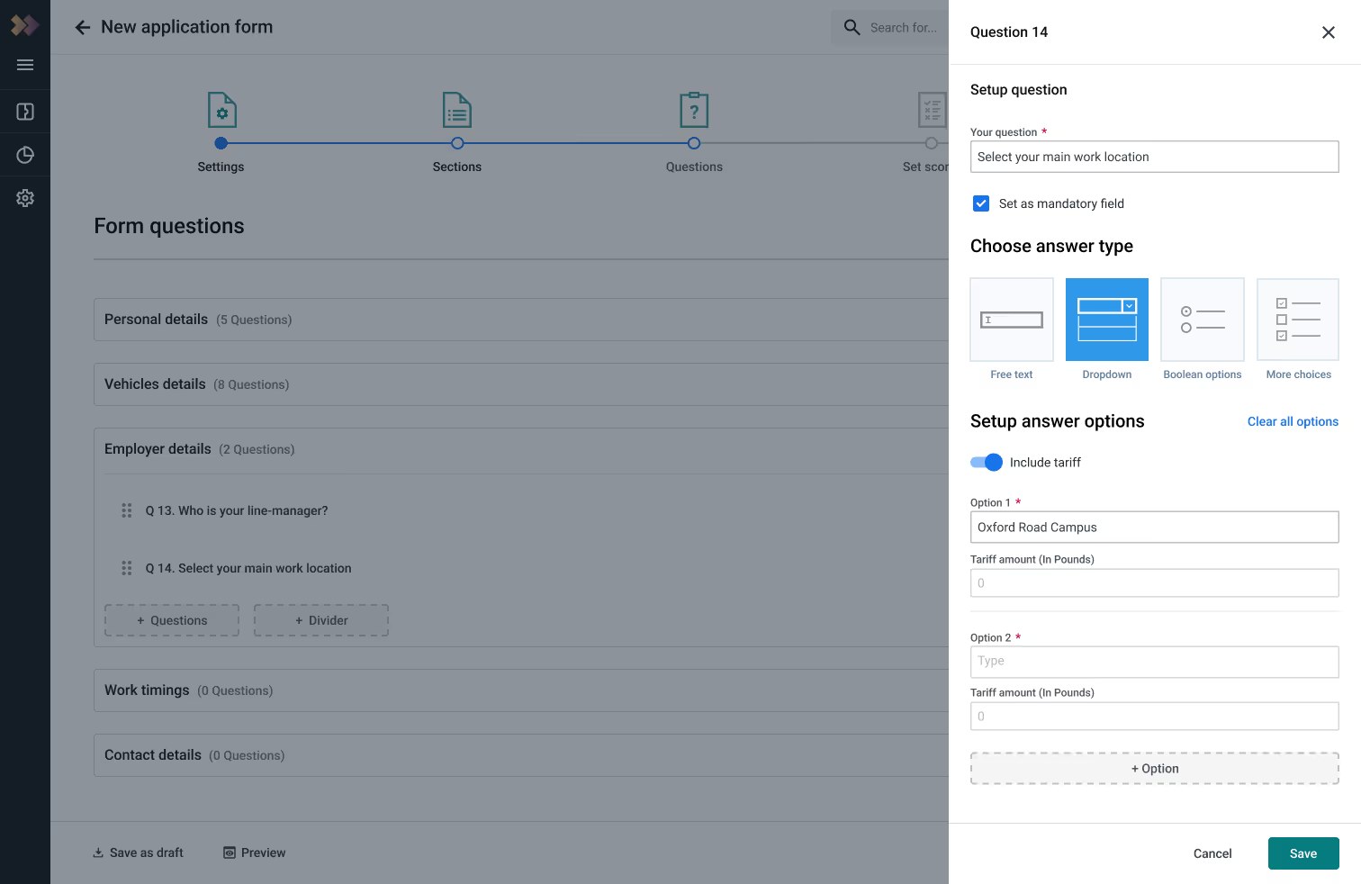
Administrators needed to construct permit applications with different questions, scoring requirements, conditions, permissions and approval rules. The original process took too many steps and too much manual configuration to get right.
The number of permit requests from end users was too large to be managed individually.
Design an end-to-end feature, starting with an MVP that streamlines car park permit requests and improves efficiency.
Made relevant controls available closer to the object being edited, rather than forcing users through repeated multi-step navigation.
Made minimum requirements, automatic-rejection rules and scoring behaviour easier to understand before publishing an application.
Let actions and outcomes respond to predefined conditions, rather than requiring administrators to manually process every scenario.
The research sorted into three buckets: an application builder for custom permit forms, change requests so end users can update an active permit instead of resubmitting, and usability wins such as autofill in the application itself.
LegacyNot everything could be redesigned at once, so new flows sat beside older ones.
Live operationsChanges to enforcement, ANPR or devices had operational consequences, so simplicity was balanced with control and accuracy.
EngineeringSolutions reused the existing architecture and components instead of adding bespoke behaviour.
Feature deep dive · Permit management
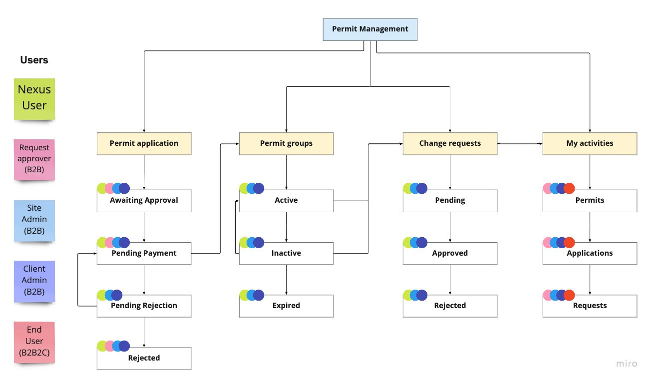
Administrators approve, reject and edit applications, group permits, and renew or end many at once. Two decisions kept the screen calm: show the next action where it is needed, and keep rarely used actions out of the way.
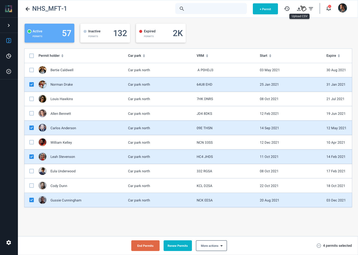
Permits grouped as Active, Inactive and Expired, each with its own actions.
Select several permits to renew or print in fewer clicks.
End permits in red as a warning, Renew as the main action, and print or download behind More actions.
RuleOnce an application is paid, it never moves back to Waiting approval.
Feature deep dives · Monitoring & Insights
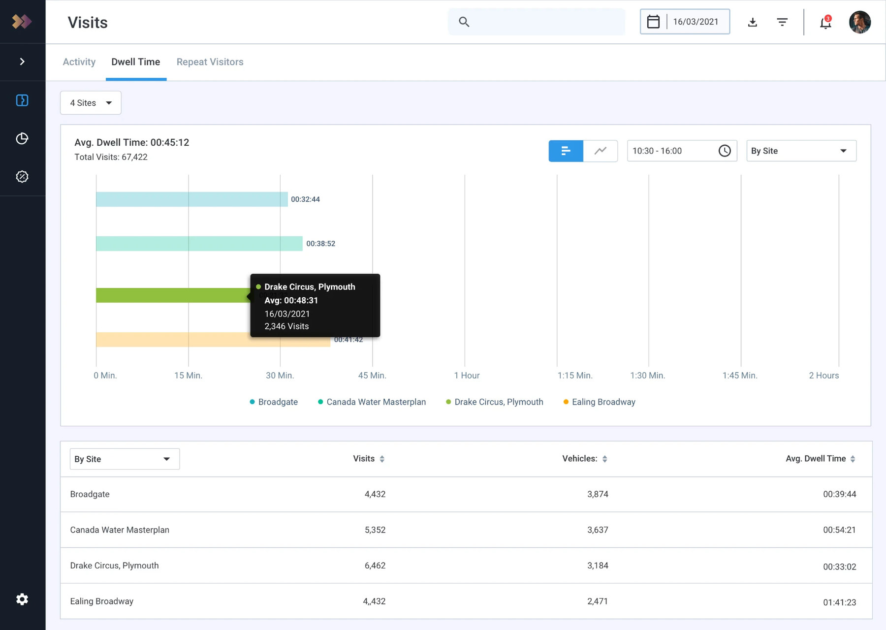
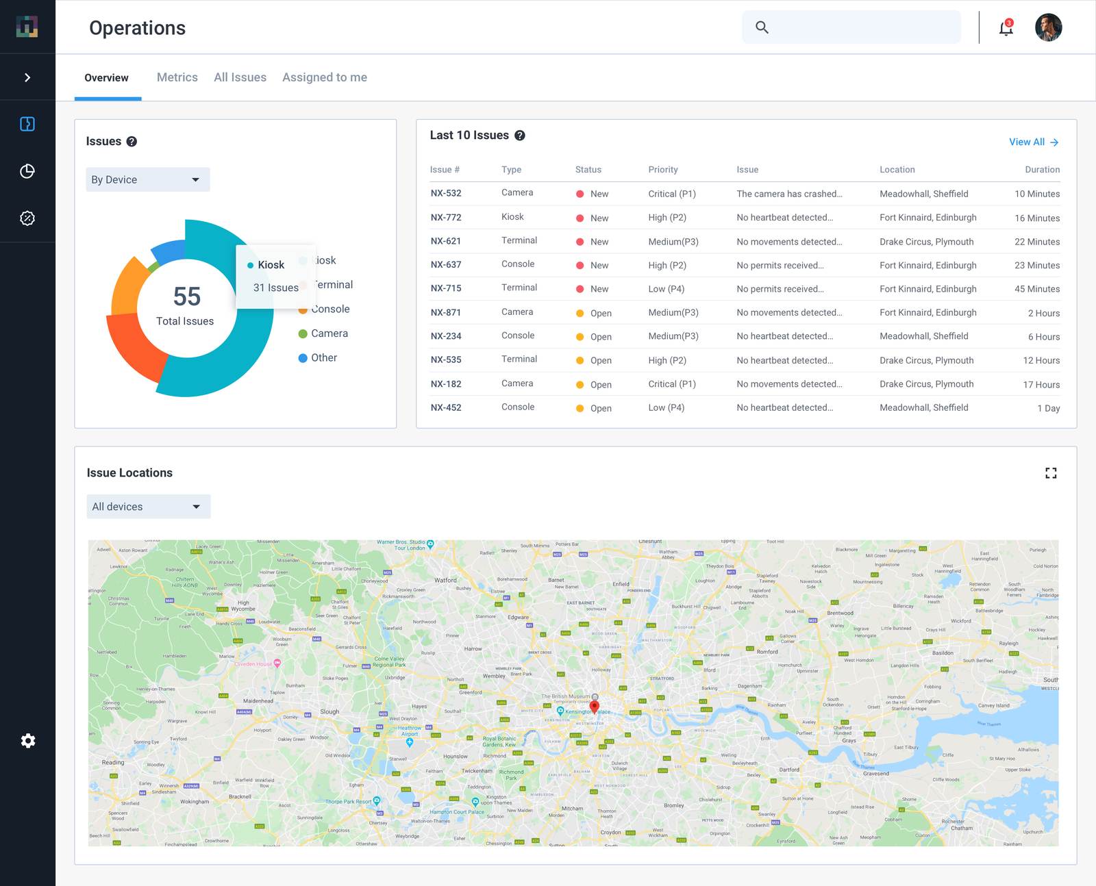
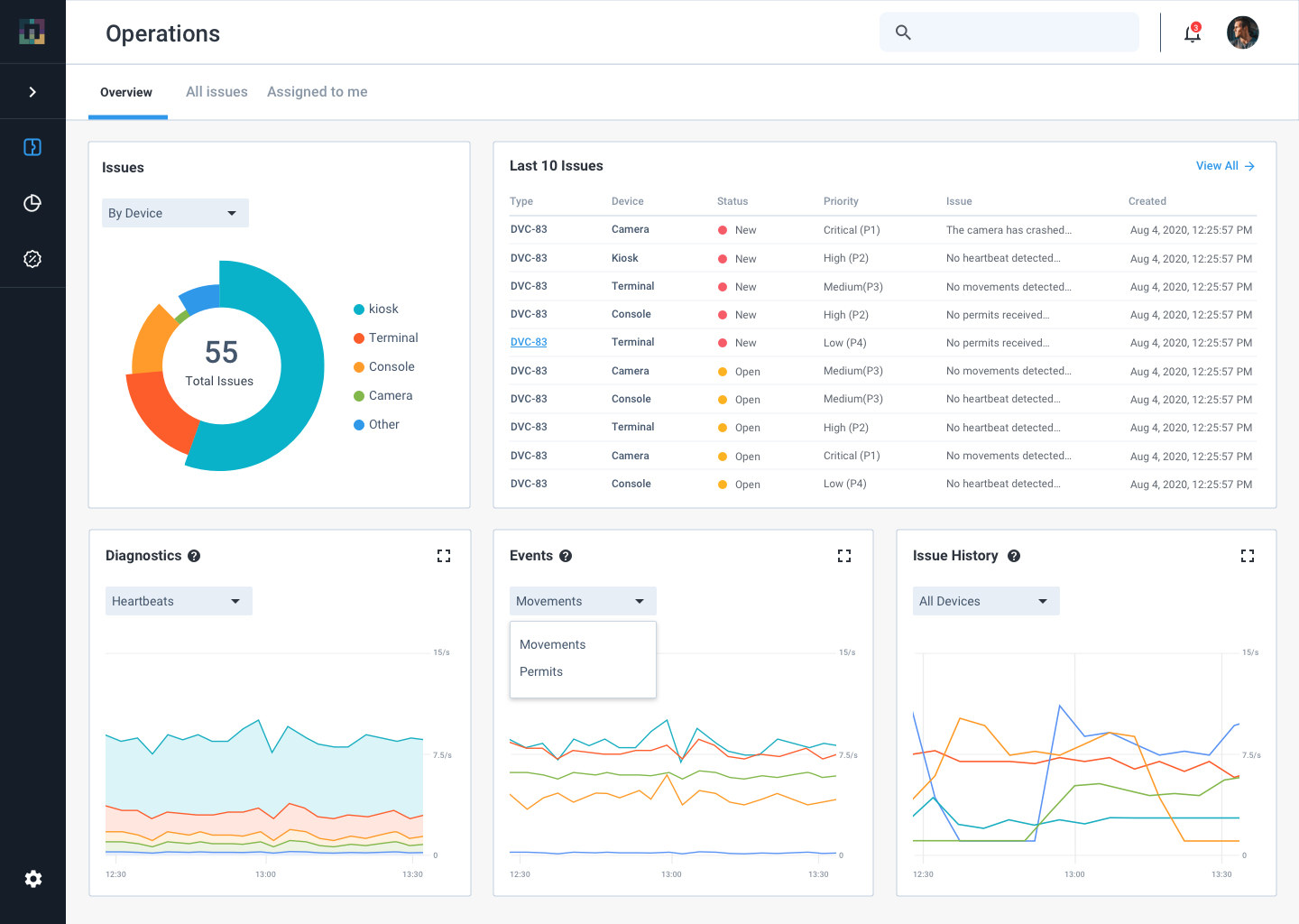
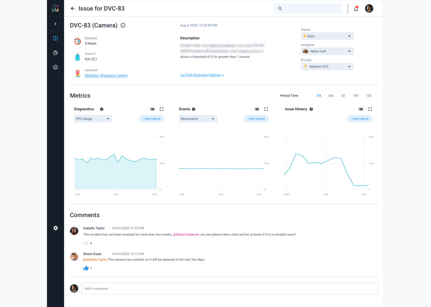
A camera that stops working means missed vehicle activity, so device health was an operational and commercial issue, not a technical detail. The views make abnormal states easy to spot, show which problems need attention first, and give operators the site, camera and vehicle context to check an ANPR read without extra navigation.
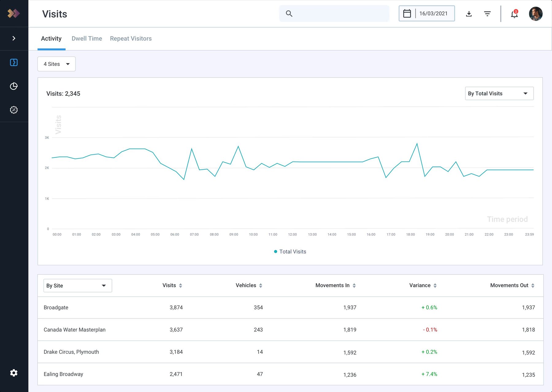
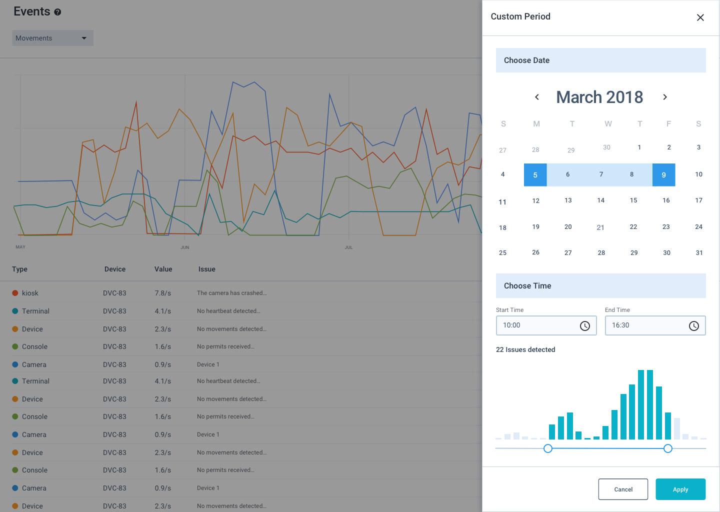
ANPR produces large volumes of movement data. Matching entry and exit for the same VRM makes a visit, which turns camera events into occupancy, duration and visit counts that clients can filter by site and date. The old donut-chart filter stopped working past ten selections, so filtering moved to a multi-select dropdown with removable chips.
Design system & accessibility
As the product grew, reusable patterns for navigation, tables, filters, forms, status and feedback shortened the learning curve between areas and made hand-off to development easier. Accessibility was part of product quality, not a separate visual exercise.
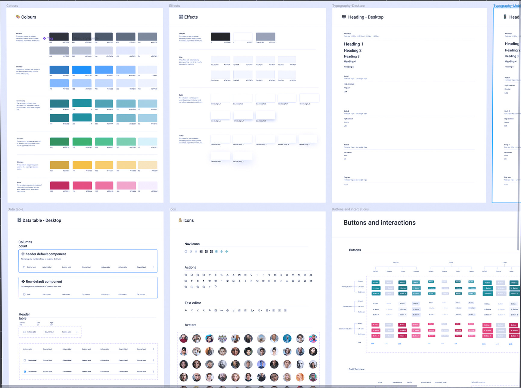
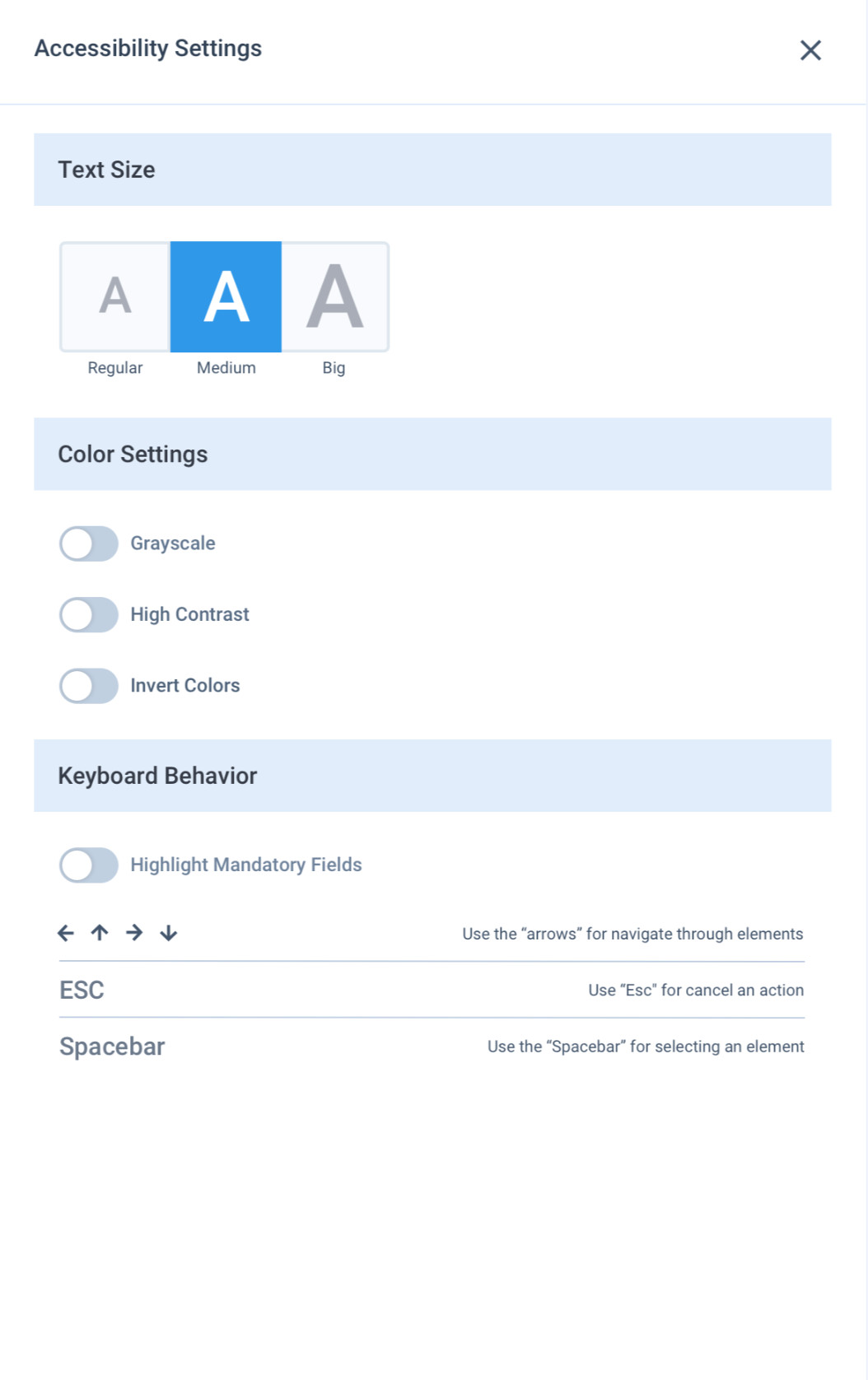
2.56:1, white on teal
5.00:1, white on a darker teal
Validate
Designs were reviewed and tested around real tasks, and what we saw went back into the design before implementation. Every chart and filter variation on the Insights side was validated with real users before it reached stakeholders or engineering.
Selected screens
A large set of operational tools in one consistent system, so users can move between configuration, monitoring, enforcement and analysis without relearning the product.
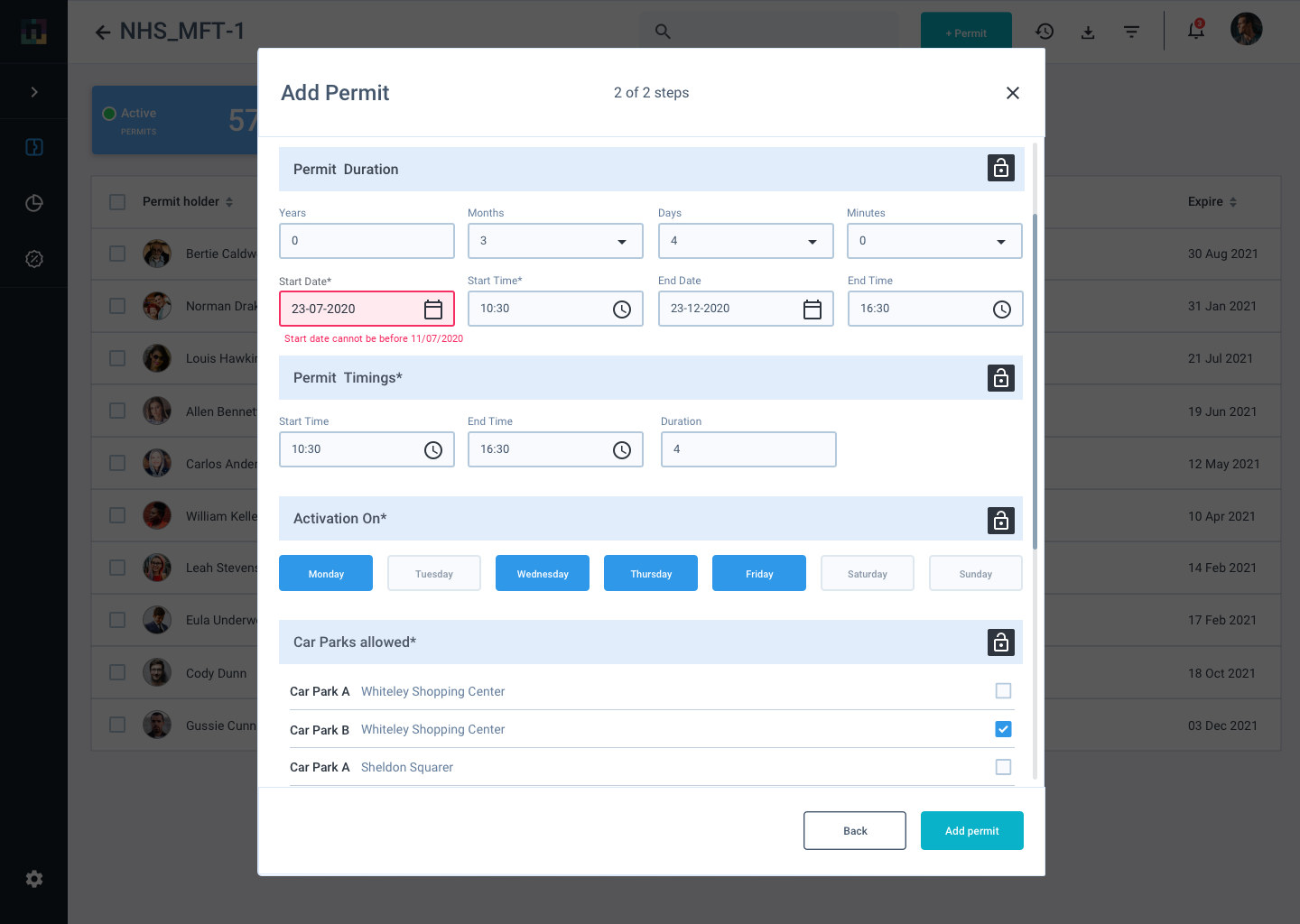
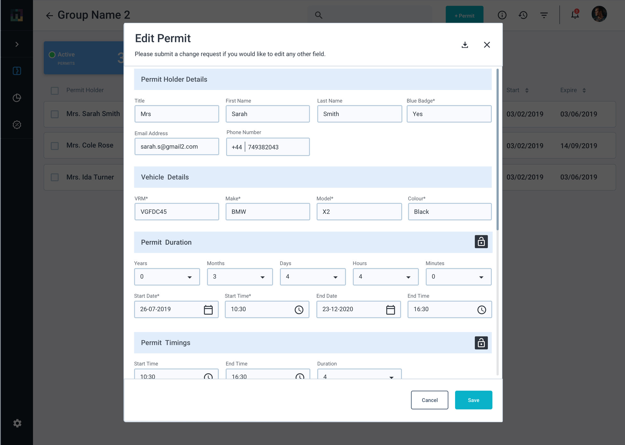
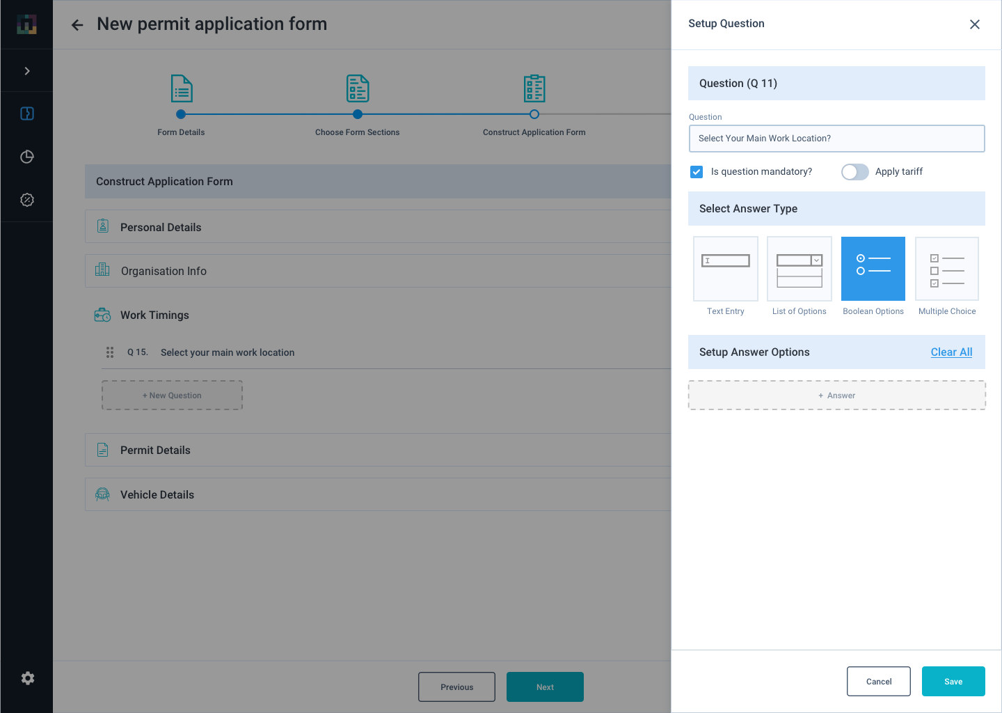
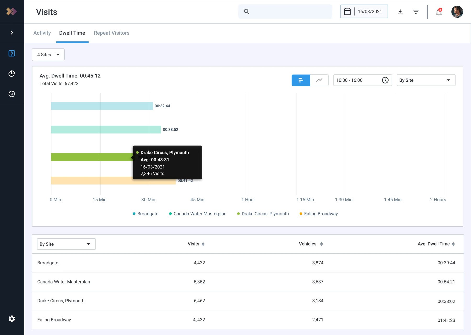
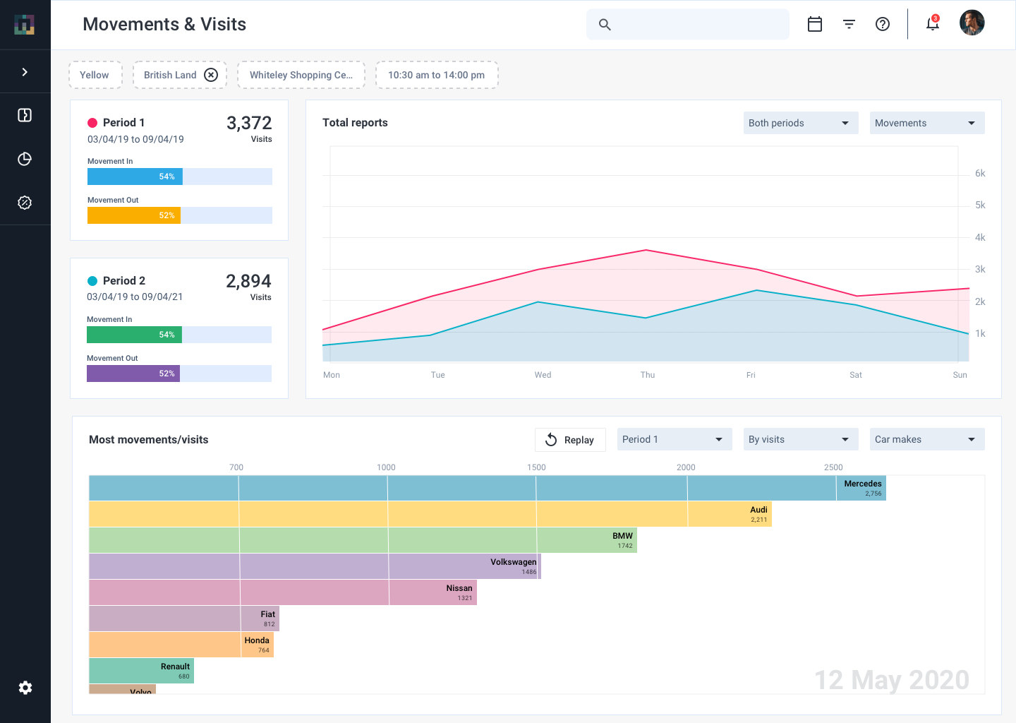
Screens marked 2021 come from my design files at the time. The product has evolved since.
Impact
The feature launched in September 2022. These are company-wide results after the launch, not design metrics from an isolated test. GroupNexus also welcomed new clients, including the NHS and PureGym.

+150
Sites the network grew by after launch.

20%
Growth in the user base over the same period.
Usability measures such as task time and error rate aren't reported here: I don't have verified figures for this release.
Reflection
Simplifying an enterprise product doesn't mean removing capability. The strongest improvements came from deciding what a user needed at that moment, and from understanding how users, workflows, data and devices affect each other before designing any single screen.
Portfolio
Next
I help teams turn scattered products into systems people can actually use, from research through to a design system developers can build from.