

Prototyping in Figma Make and Google AI Studio
I built interactive prototypes in Figma Make, then tried the same flows in Google AI Studio to compare how each handled turning a design into something clickable.
Case study · Eventogy
Redesigning an iOS mobile app for corporate event attendees, delivering a sleek, modern look while dramatically enhancing usability and the overall event experience.
Overview
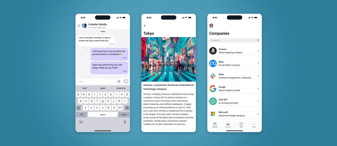
In March 2025, Eventogy planned a comprehensive rebuild of one of its iOS apps, aiming to modernise the app's design and enhance user experience in line with contemporary best practices and standards. Eventogy was building a new web platform at the same time, and the iOS app had to follow the same logic, so I worked closely with the project owner and iOS developer to keep both in step without adding unnecessary complexity to the designs.
Objective: redesign the existing MVP screens and document recommendations for future releases, to improve the app's engagement rate by 10%.
Process
This project started when most of these tools were brand new, so I treated them as things to test and compare rather than trust outright, alongside more everyday use for the work that sits around the screens themselves.
I built interactive prototypes in Figma Make, then tried the same flows in Google AI Studio to compare how each handled turning a design into something clickable.
Research and analysis work ran through both Gemini and OpenAI side by side, comparing their answers against each other rather than taking either on its own.
I tested Midjourney against OpenAI's image tools for reference and placeholder content. Midjourney came out ahead for this project, so most of the generated imagery came from there.
Gemini handled setting up meetings and connecting with Google Workspace, plus organising user stories and research; OpenAI covered similar ground: research, user stories and general documentation for planning.
Impact
To evaluate the impact of the redesign, I tracked a set of standard, measurable UX and product metrics: a clear view of how the new interface improved efficiency, reduced friction, and supported both users and the business.
Automated audit score against WCAG, not a full manual conformance review, rising from 65/100 to 95/100.
Design Consistency Rate: my own tracked measure of screens aligned to the new design language, not an industry-standard metric, increasing from 77% to 95%.
Self-reported sentiment on the redesigned experience, sample size not separately documented, improving from 6/10 to 9.5/10.
Designer-tracked metrics from this engagement, not a third-party study; sample sizes and measurement windows beyond "before vs. after launch" aren't separately documented.
Personas
B2B user: Configures the app's pages and sets permissions for the event.
Internal user: Provides assistance to the Admin user and attendees with any issues they encounter.
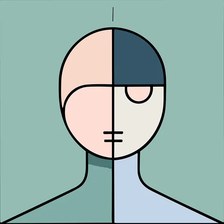
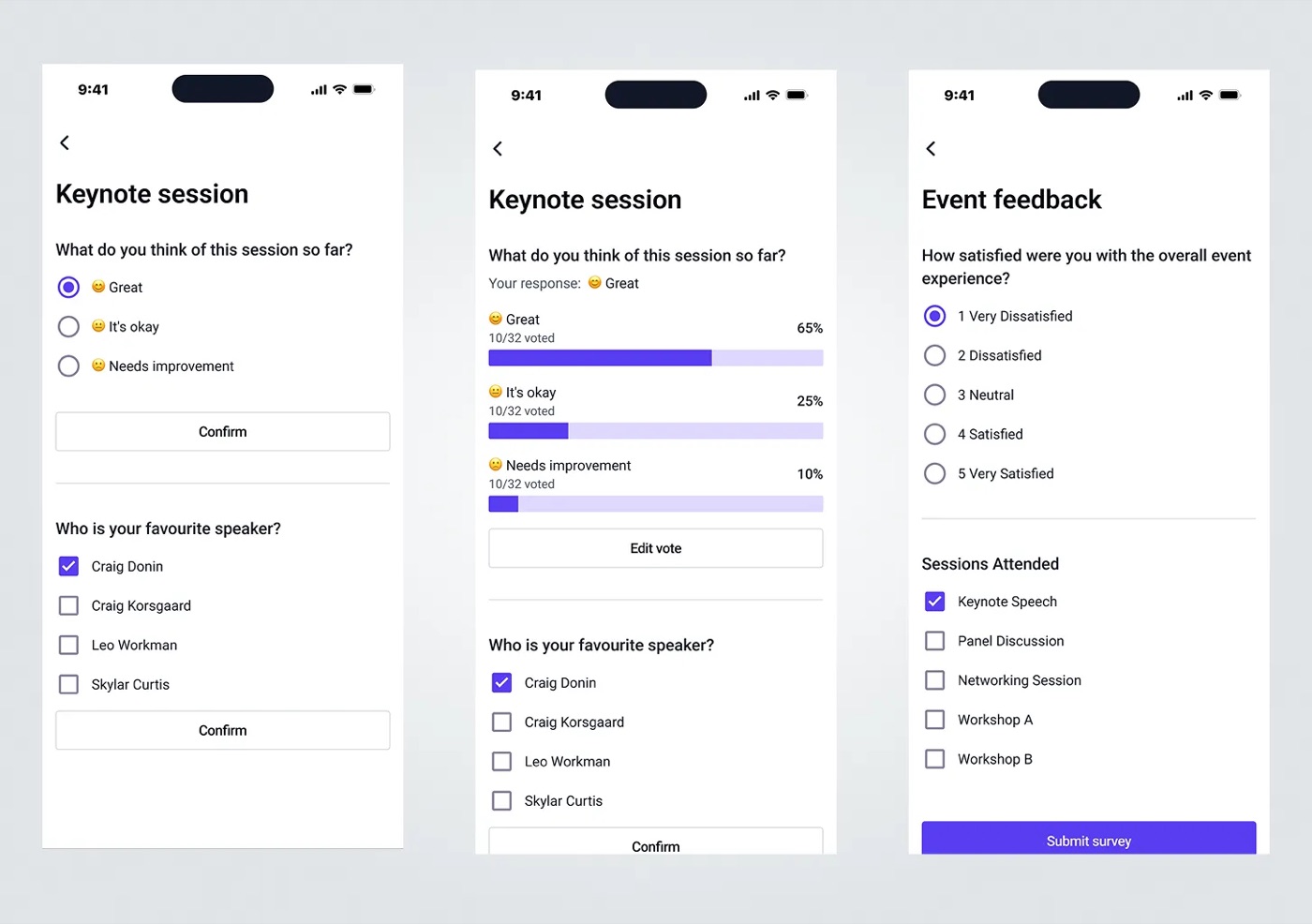
B2B2C user: Uses the iOS app to access event details and features such as live polls.
Web application overview
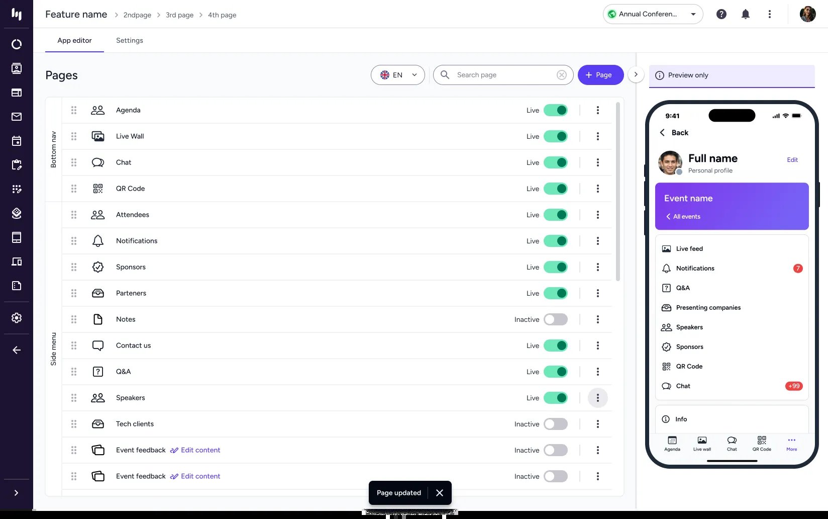
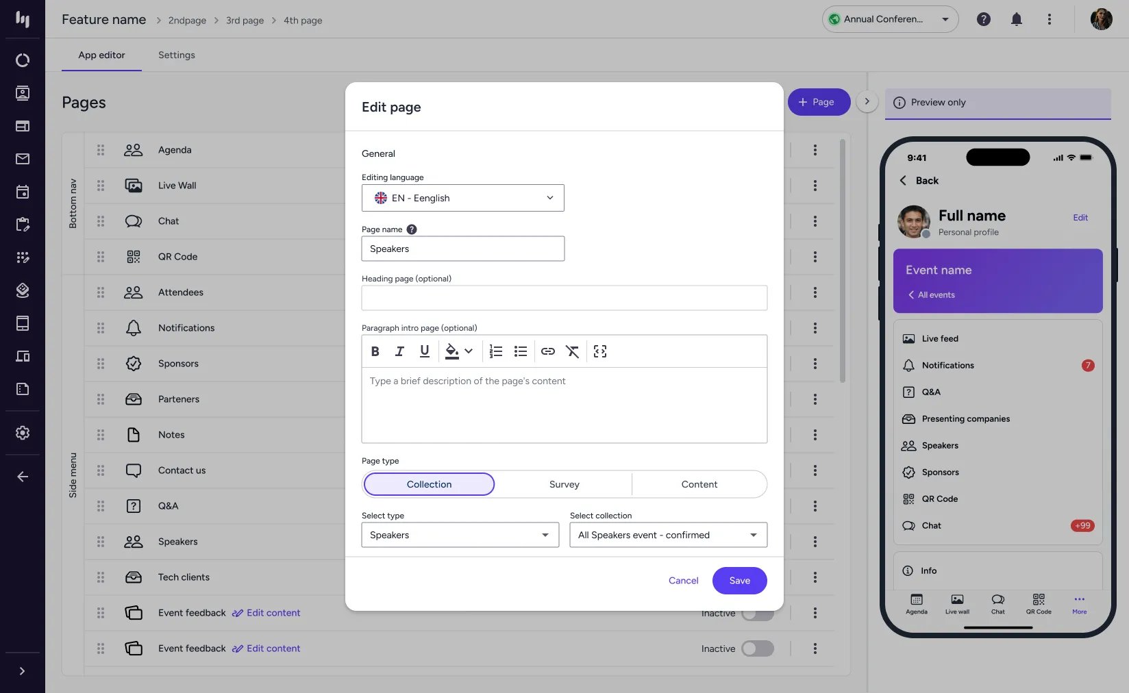
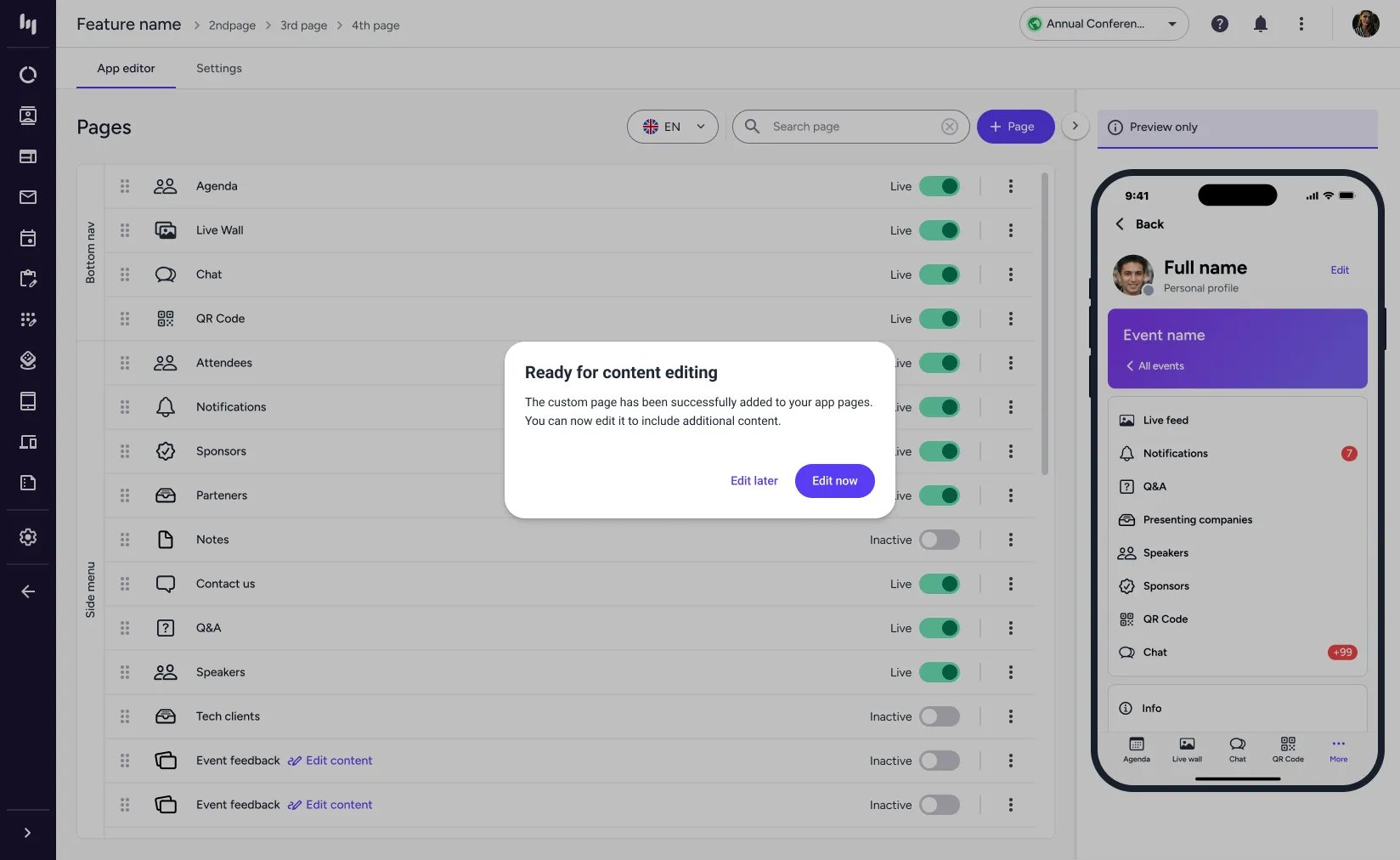
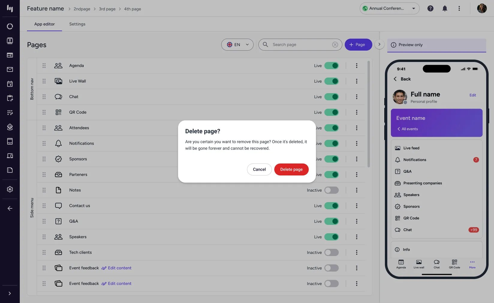
Admin users control and manage the app's pages through a companion web application. The following screens show that builder: some pages follow standard templates, while others are customised, for example event-speaker collections or HTML pages with tailored content.
Engagement tools
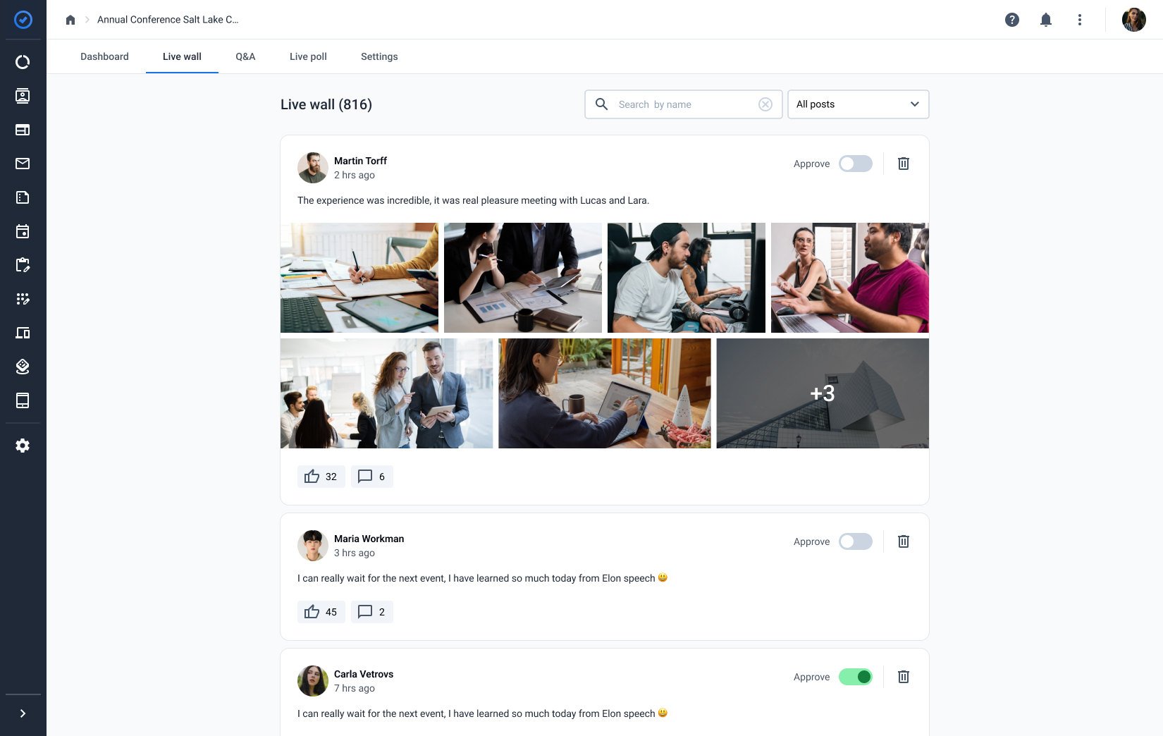
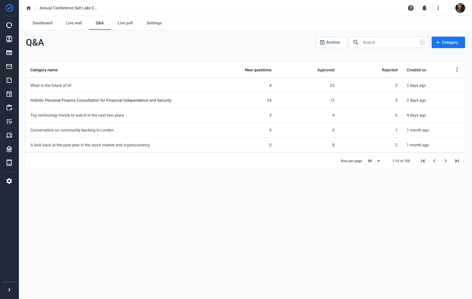
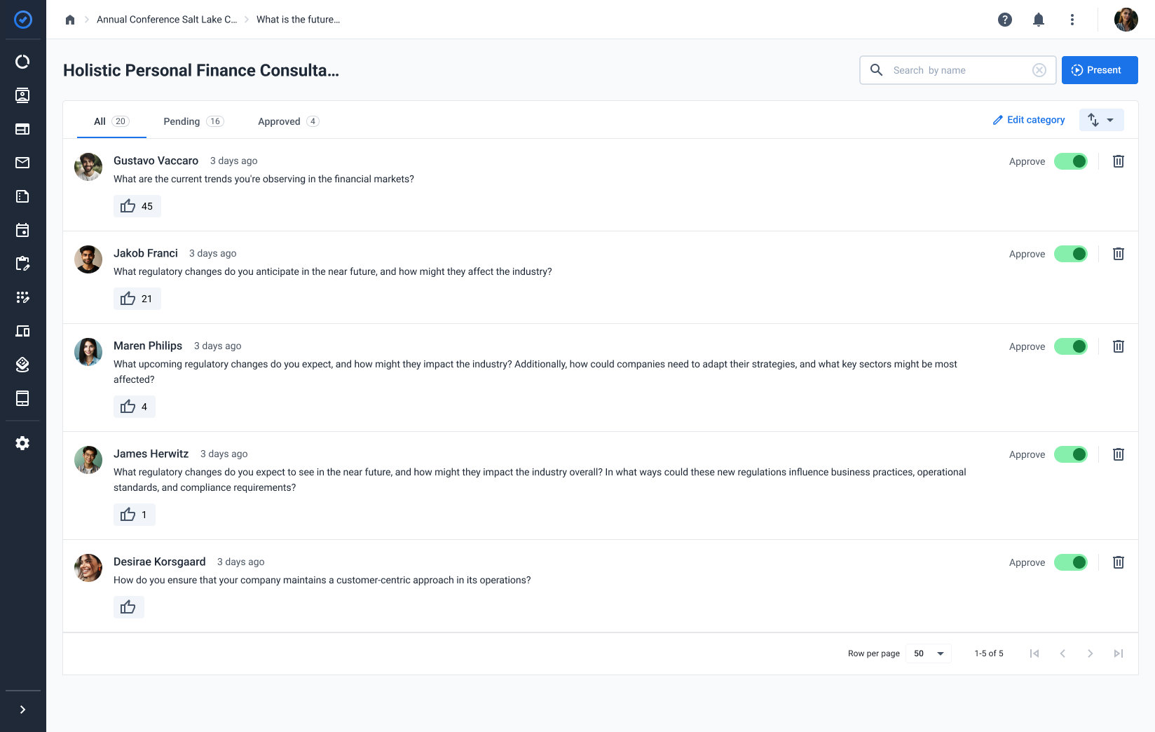
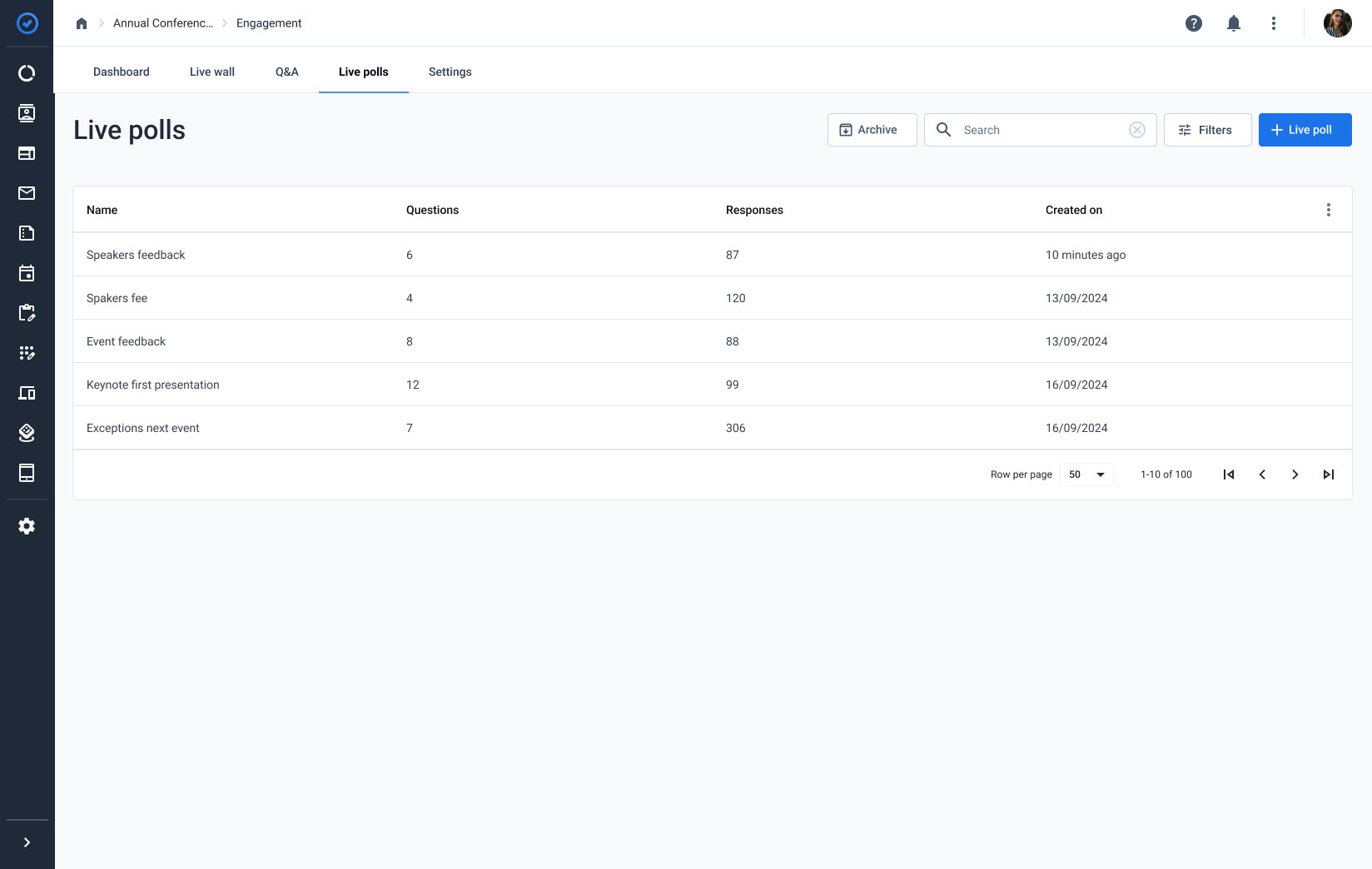
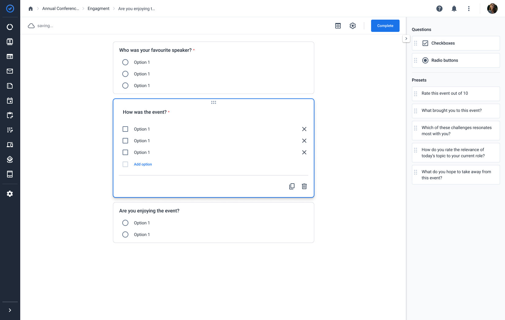
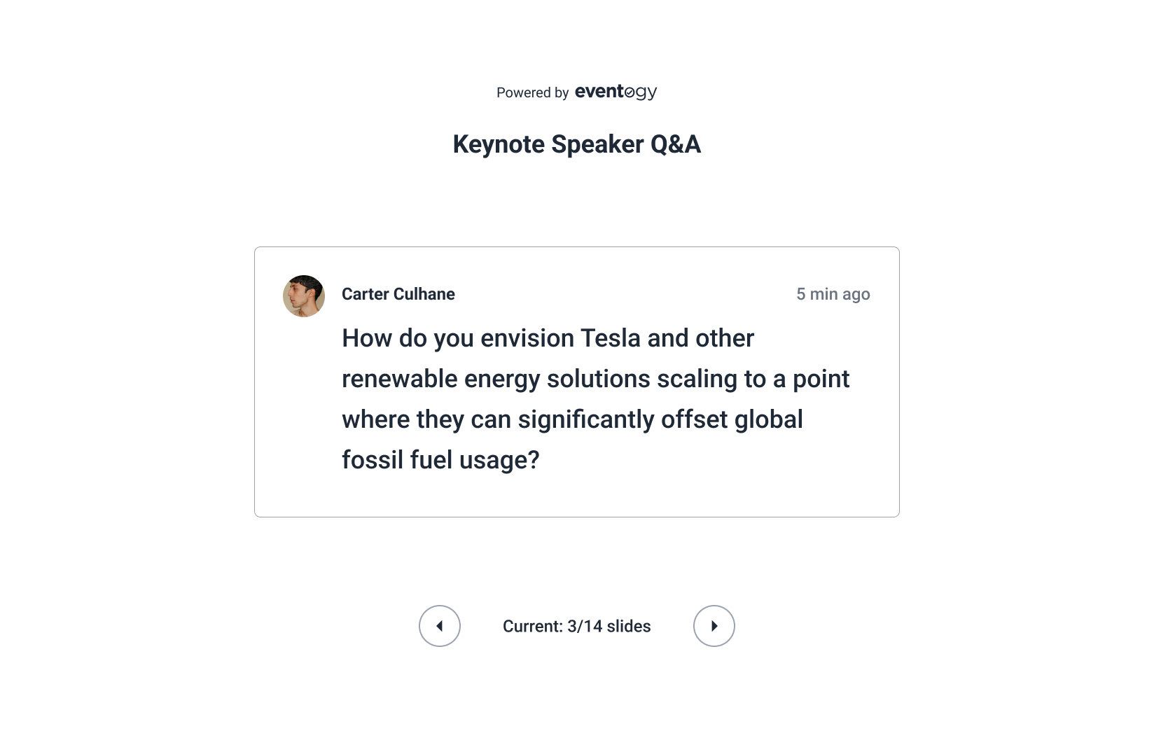
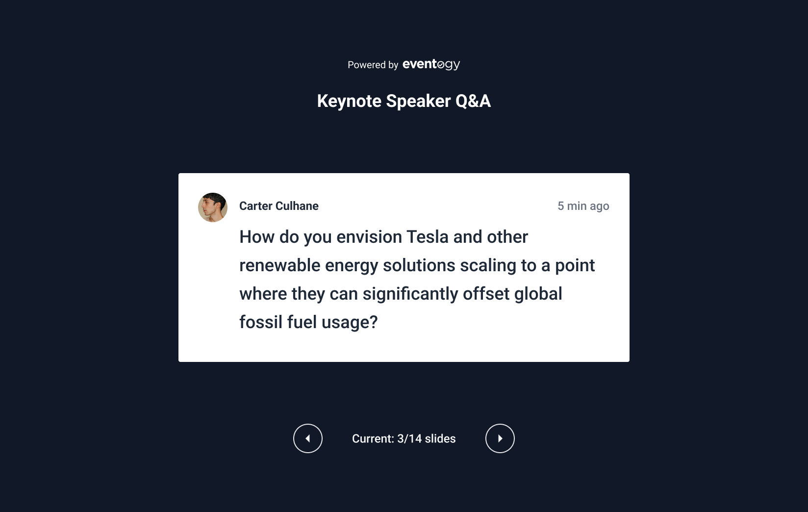
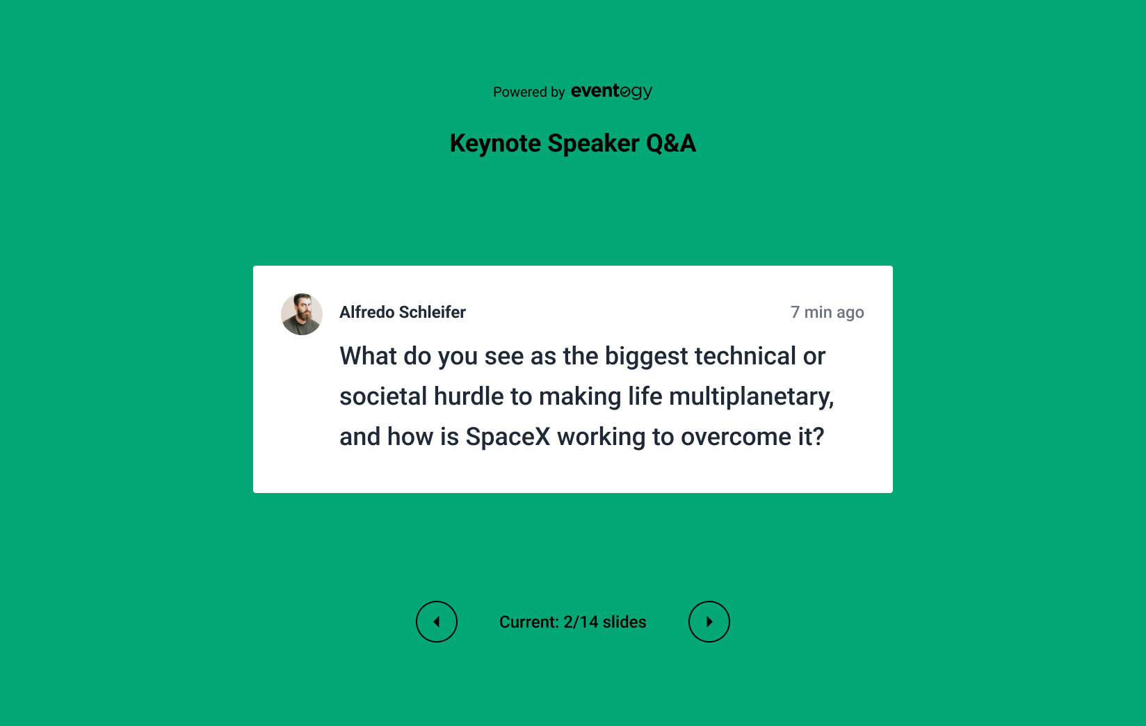
Attendees join in through three tools: they vote in live polls, send questions, and post comments and pictures to everyone on the Live wall. Admin users run all three from the web app, approving posts and questions and building polls. A presentation view puts the questions on a screen with a slide controller beneath.
Constraints
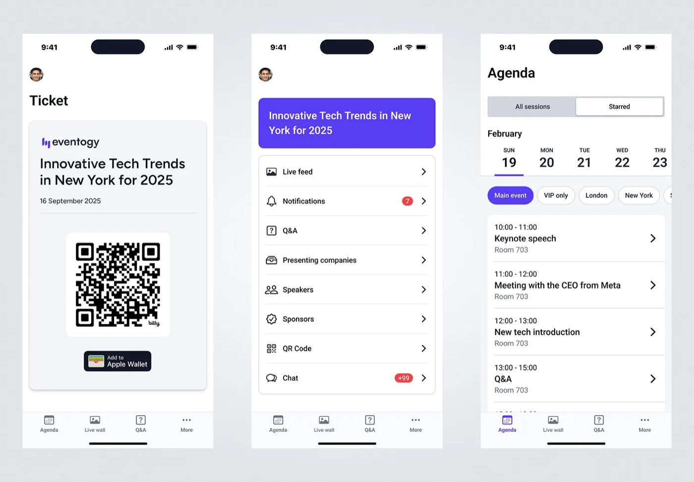
We used the existing solution as a reference, which already provided the essential functionality attendees needed: accessing the event with their tickets, or taking part in live polls. Within that, we made several UX improvements focused on modernising the UI and ensuring scalability, so clients could seamlessly select their own brand colours.
Research
I looked closely at a range of top mobile apps to see how they handle navigation, visual hierarchy and interaction (easy navigation, eye-catching visuals, smooth transitions), and brought what applied back into this design. That review shaped the design process and gave the team a benchmark for how user-friendly and effective the new app needed to be.
Design
I listed every feature and category that needed a fresh look and tried out different directions for each. Since this was a native app, every idea had to line up with Apple's iOS guidelines, which meant regular conversations with the iOS developers to brainstorm within the project's timeline before a direction was locked in.
Portfolio
Next
I help teams turn scattered products into systems people can actually use, from research through to a design system developers can build from.